
Over the weekend, I finally got around to making a ("hillbilly," as Annie Howes would say) light cube, thanks to the highly amusing tutorial over at Elegant Bloggery (one of my faves!), which ultimately led me to this other, less amusing, tutorial by Strobist.
Once I had my cardboard and tissue paper monstrosity assembled (while enduring the endless heckling from my husband), I set the whole thing up in the craft closet, closed the door, turned out the lights and voila! The end result is a bright and white as if I'd been outside on a crystal clear morning. Here are a few more examples:
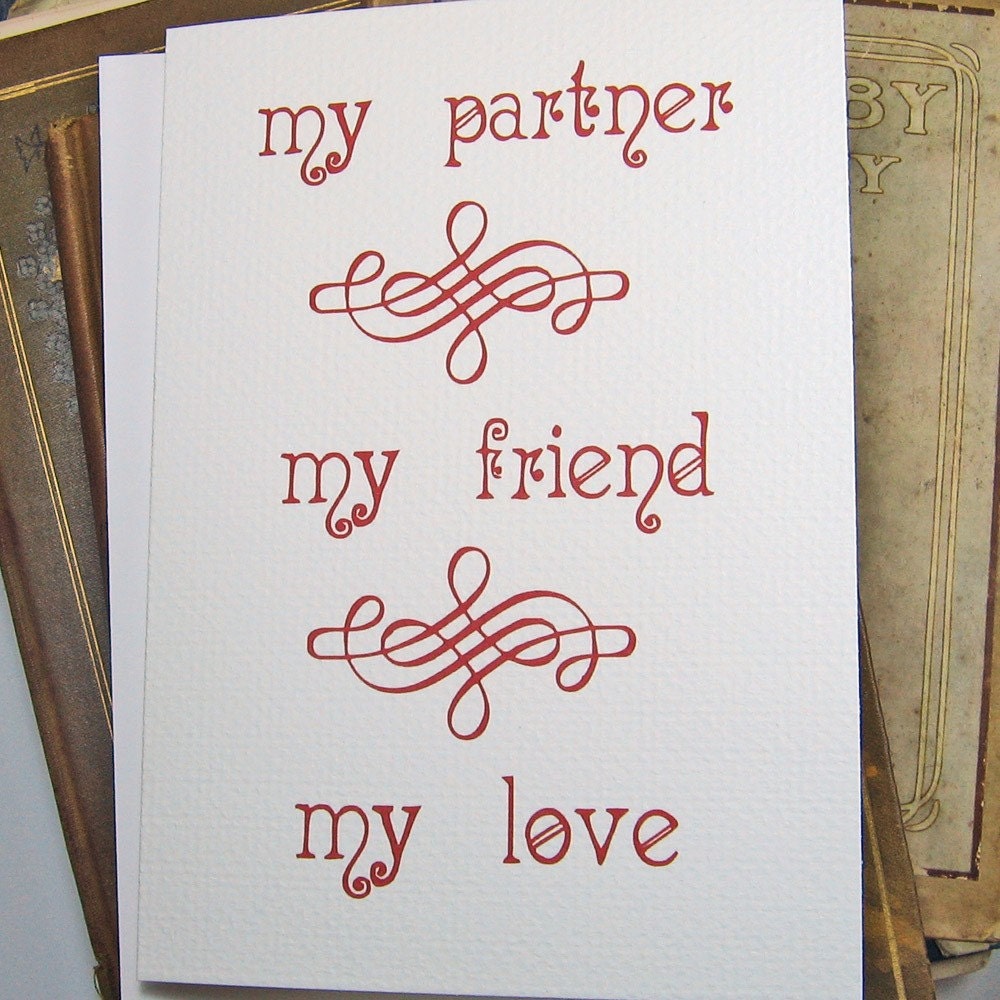
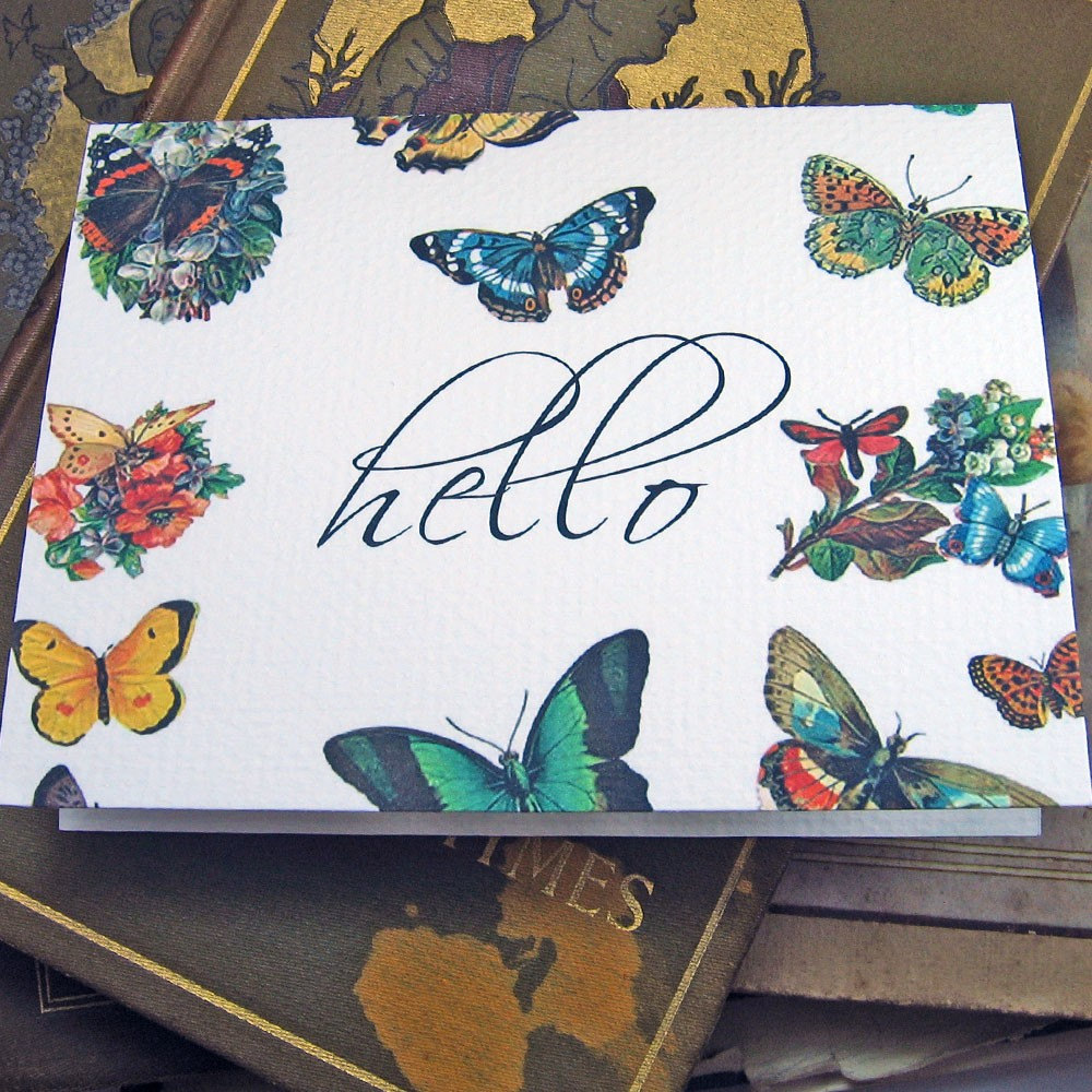
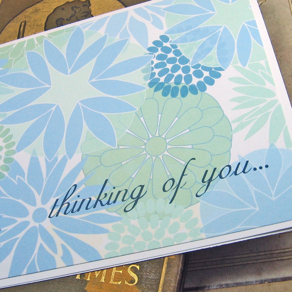
What do you think? Better? They're still not perfect, but I feel like I'm getting there. At least they're in focus and my whites are white. What are your feelings on the props? Leave an opinion if you wouldn't mind - I definitely need some input. Be brutal. I'm a big girl!


5 comments:
I always thought your pictures were great!
Wow, I really can tell a difference! I thought they were great before and now they are REALLY great! I also like the props. I guess I need to get to work on my light box.
I didn't see your old photos but these look super...also like that thank you card quite a bit! :) ~Tina
Great job!!!
I think your pictures are fabulous!! And I'm glad you enjoyed my tutorial :)
Post a Comment